Fernvy is a crowdsourced travel guide built via of the collective wisdom of the internet. We scrape travel and destination content with high utility and relevance then compile and deliver it to our users.
The founders had the roles of CEO and CTO respectively; the CTO was the lone developer on this project and focused mainly on the backend and ML algorithms. There had already been 2-3 iterations of the frontend for internal focus group testing, but a major complaint was UI/UX. I was brought on to help relieve the CTO of frontend developer duties; specifically, I was tasked with:
The first redesign used Material UI and with a central focus on maps to aid in information discovery. Initial user feedback of the POC showed that we misinterpreted the key issues users had with the prior versions. Using StoryBook to quickly iterate on isolated components to show off new designs was very helpful in staying Agile. However, having lost time, we needed to be faster. So I took over the entire frontend pipeline from design to release.
The second redesign focused more on data presentation and organization. I would ideally use SSR (perhaps Next.js) for this, but given the time constraints, I did not want to spend time ramping myself up on learning a new framework. So we stuck with React instead. We also went with Ant Design over Material UI because the base design language had a greater density of information. Material Design’s paper concept uses too much whitespace by default in its design language. This reduces the amount of information that could be displayed at once. While we could have customized the styles, it would take too much time to make adjustments that kept the Material Design aesthetic consistent and looking good. Changing design languages was the more pragmatic choice.
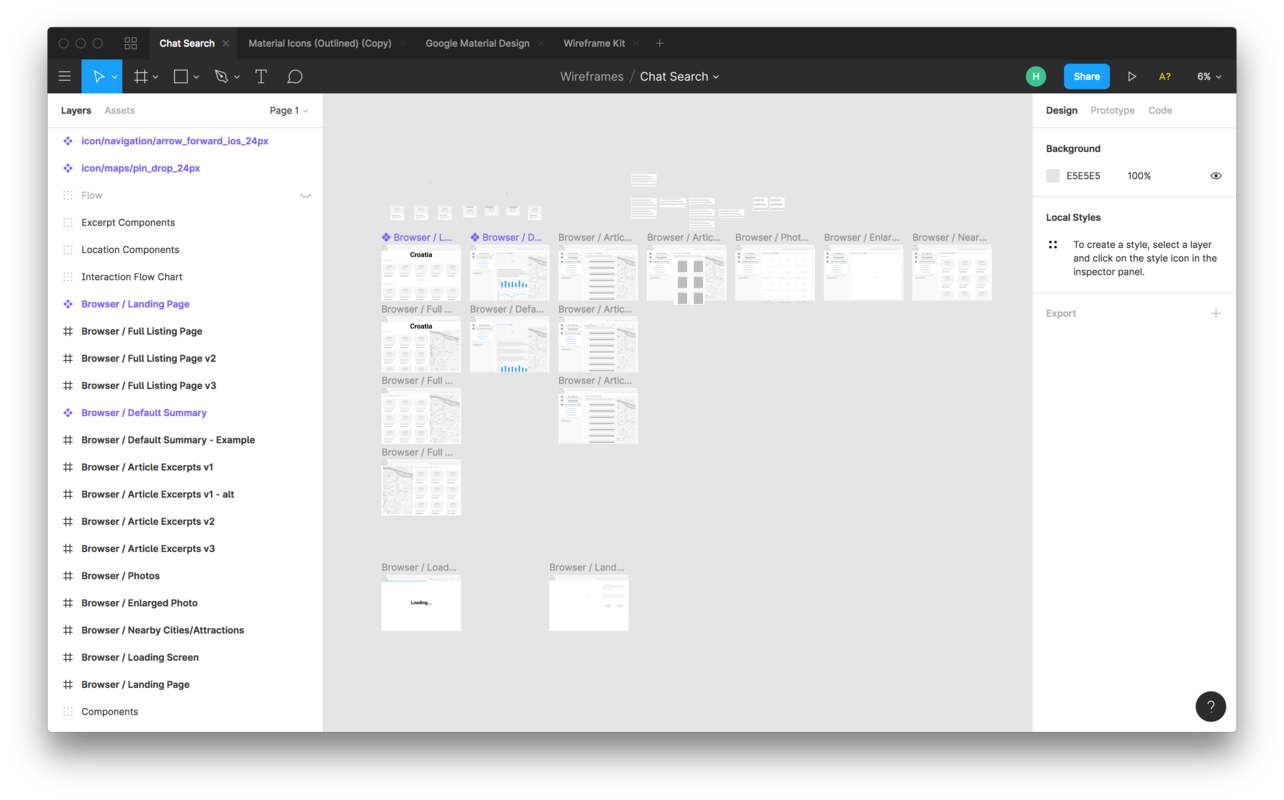
I then began making mocks and workflows of all my design ideas. I chose to use a popular collaborative design tool called Figma. This allowed quick feedback despite the team’s time differences. We settled on a concept that used a “chat bot” paradigm to provide familiarity and guidance in helping the user learn how our data is laid out.
To help future contributors, I kept a live README that was updated anytime:
yarn scripts were addedTo maintain a consistent codebase, I then detailed:
Styling in particular was interesting as I chose to use what I knew - SASS + CSS Modules. Ant Design uses LESS for customization though and to get it to work with create-react-app, you had to use react-app-rewired to customize the Webpack configuration. There were some oddities that I had to document with this setup, but overall it worked well.
To help build components in isolation and manually test our styling, StoryBook was used. It worked well enough until the app got very large. At that point, I made the decision to abandon it for complex components as I didn’t have the time to continually update the base configuration every time a new global dependency was added (for example, connect-react-router). Instead, it was used to design functional components only with the intent of going back after release to add support for complex components when time permitted.
The design of the code architecture evolved from the goals and reality of the project:
With all of this in mind, I spent the most time detailing how the API architecture should be handled. This allowed the frontend to cleanly separate:
To do this, there were three primary layers of code that had to be implemented anytime you retrieved information from the API. This was heavily influenced by hexagonal architecture as a way of defining clear separation of responsibilities in the frontend code.
fetch (headers and all) with nothing else chained to it. That way, anytime the backend API was changed, we knew that this file had to be updated.Promise chains to it to handle the return. This decoupled the business logic of the frontend from the backend. Components could consume these internal adapters and if anything changed in the backend API’s return, we didn’t have to fix anything in the UI/component layer.redux, redux-thunk, and action creators were heavily used to keep state and data changes in a single layer (the action creators). This allowed for error handling to be cleanly separated into a single layer. Most importantly, this allowed most components to be “dumb components” whose job was to render state changes.In addition to this, the component structure was kept as flat as possible as this first iteration of the frontend was not complex enough to warrant a complex folder structure. This gives new developers an easier onboarding experience and doesn’t confine them into a pattern that may not accommodate future direction changes in the app.
This second redesign took about 2 weeks time of work to complete. It totaled:
That includes Flow typing, StoryBook files, and jsdoc for commenting all important functions.
As a proof that the code architecture worked well, every single bug and design change that was given as feedback during our 2 days of internal testing were fixed in the same day they were reported. Isolating, reproducing, and debugging went very smoothly.
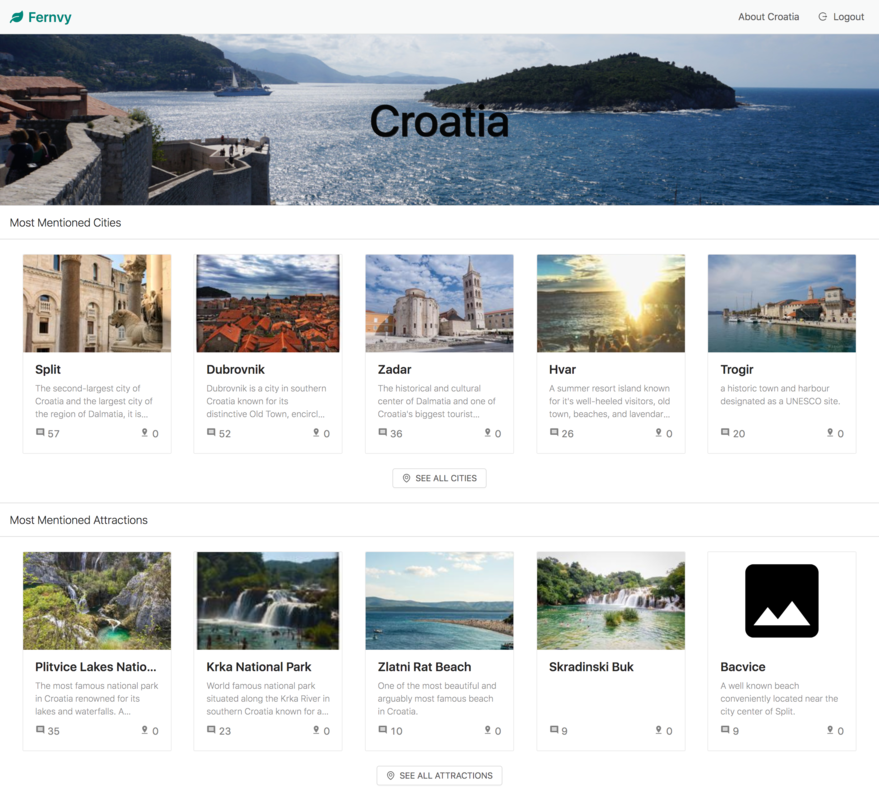
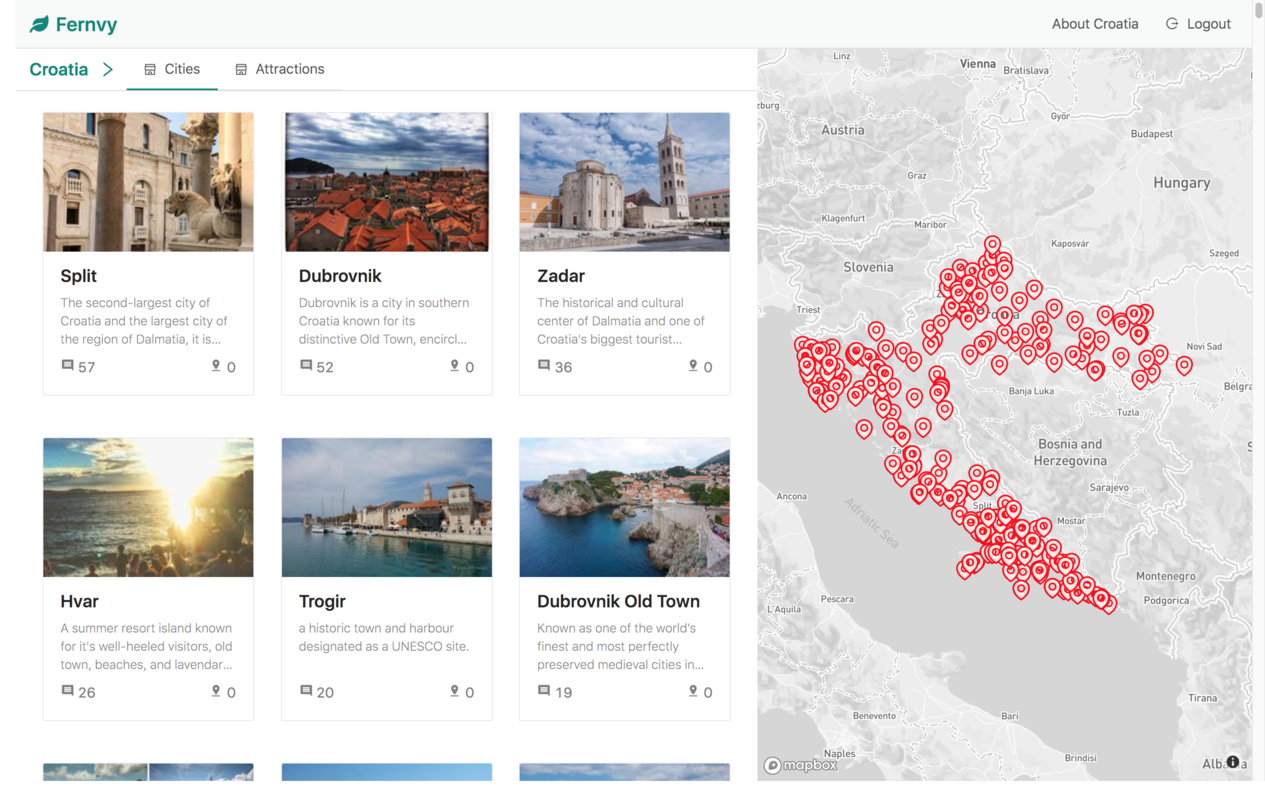
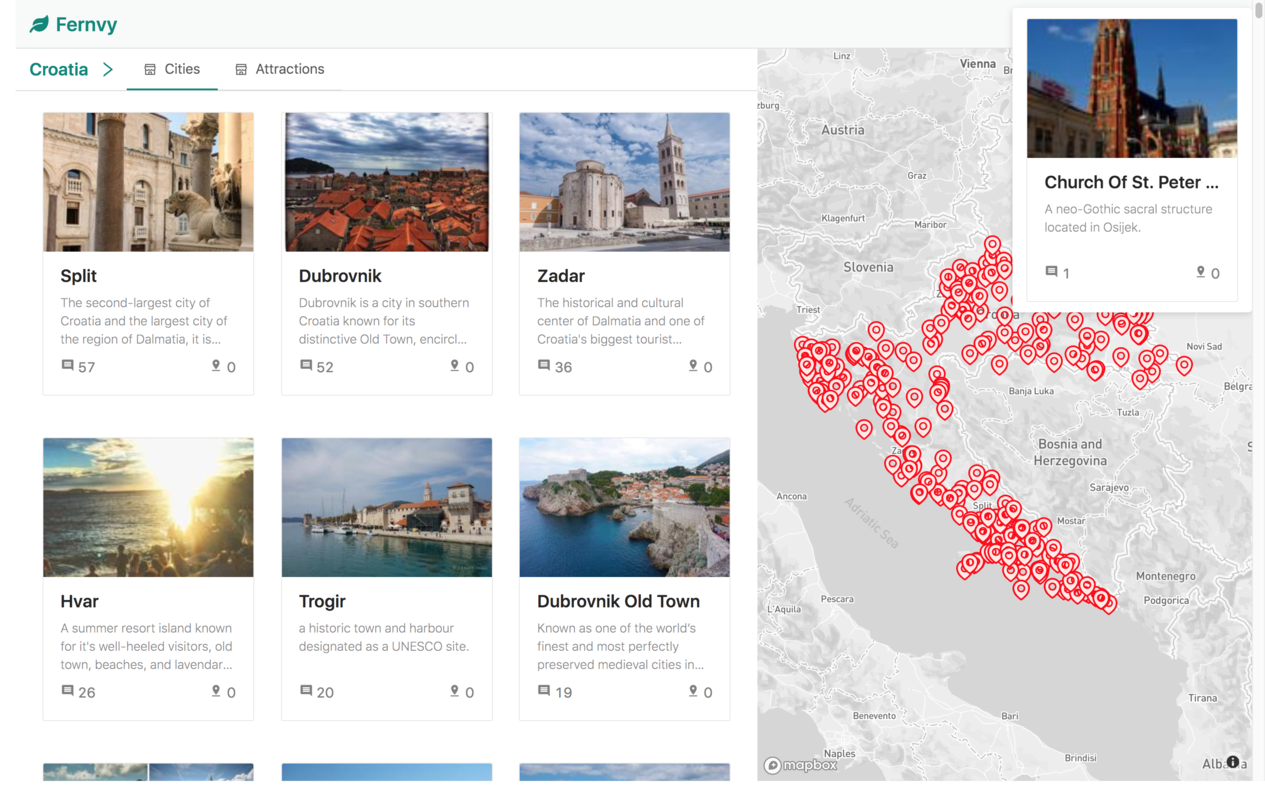
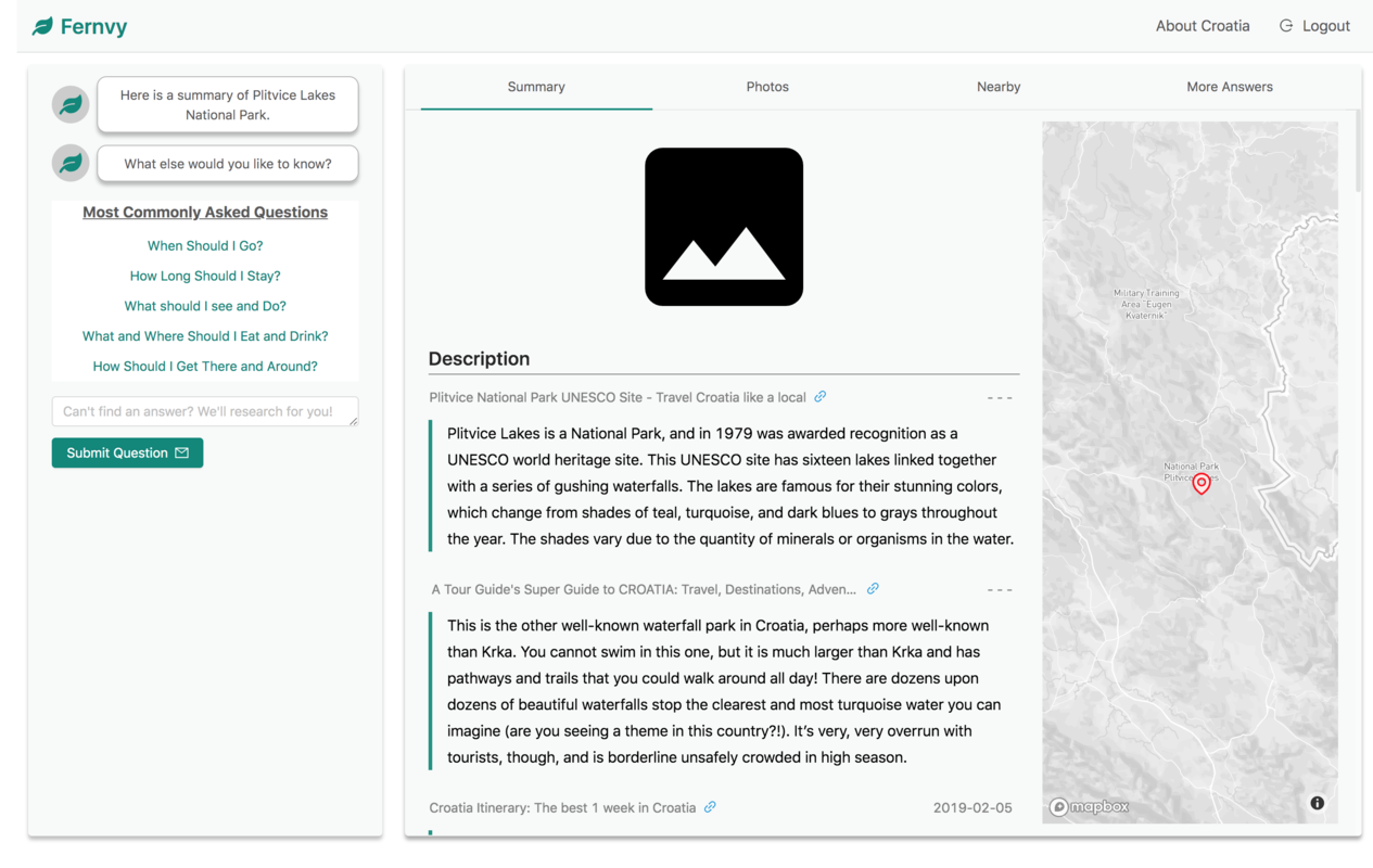
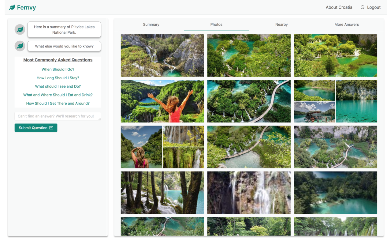
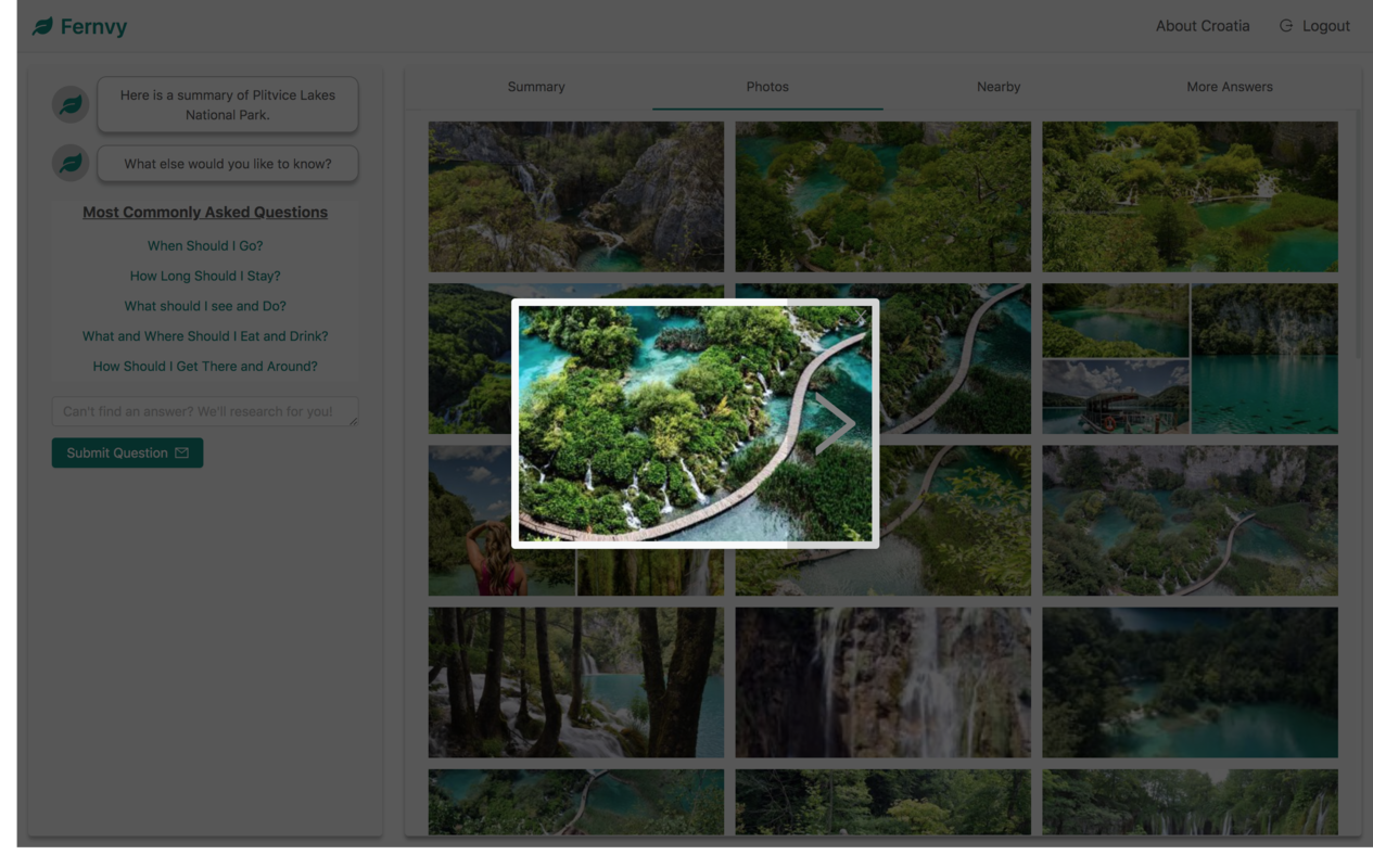
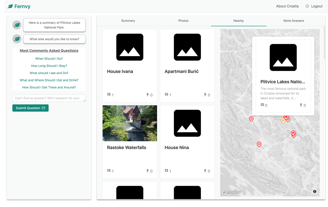
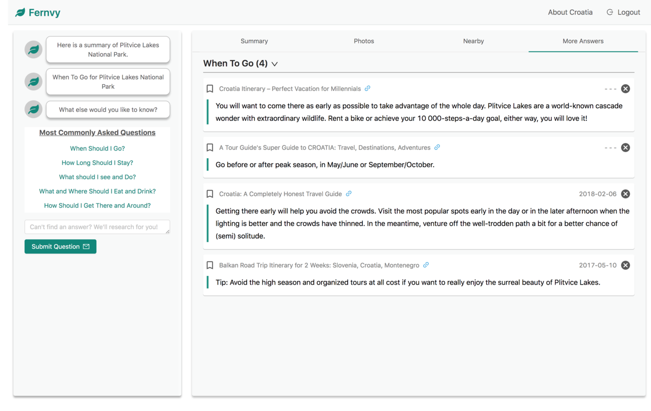
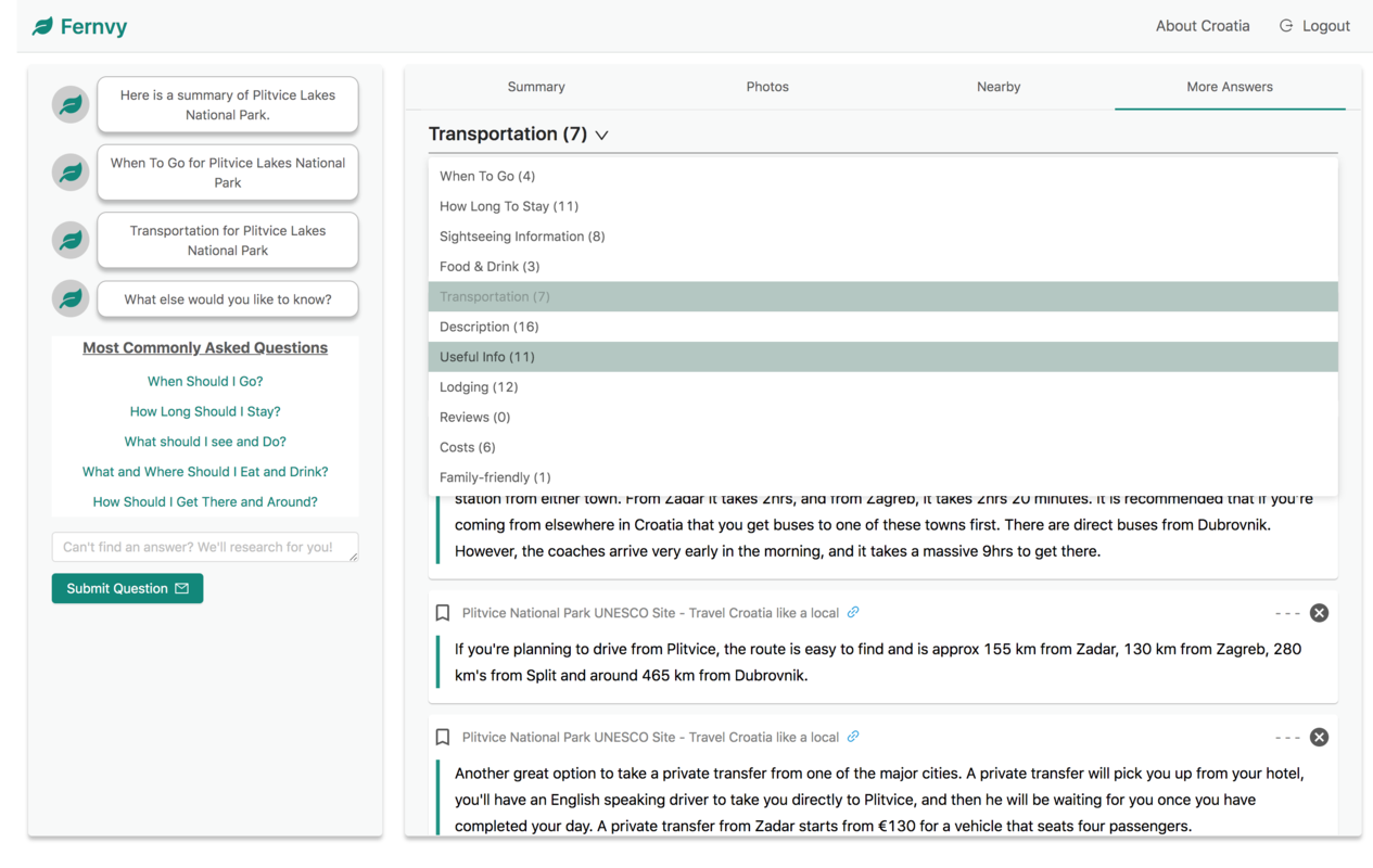
Since the app isn’t live yet (only distributed to a focus group for feedback), here are a bunch of screenshots of the final product. Enjoy!
Notes:
